Magnetic Movie from Semiconductor on Vimeo.

Wednesday, February 29, 2012
Monday, February 27, 2012
3rd Quarter Deadlines
DUE MARCH 9th (in addition to earlier projects):
Art I:
Shoe Project
Art II, III & IV:
Two large or four medium or six small projects
Art I:
Shoe Project
Art II, III & IV:
Two large or four medium or six small projects
Quote o' the Week
"Begin doing what you want to do now. We have only this moment, sparkling like a star in our hand, and melting like a snowflake."
~ Marie Ray
"Don't put off your happy life."
~ Author Unknown
~ Marie Ray
"Don't put off your happy life."
~ Author Unknown
Yearbook due this week!
Good morning!
Yes, the time has come! After all of our hard work and dedication, it's time to turn in the whole yearbook! While most of the pages have been completed and turned in, we still have a few more to go. Let's work together and finish our yearbook as a team! It's looking fabulous and I appreciate each and every one of you!
Yearbook Deadline: March 2nd, 2012
Friday, February 24, 2012
Thursday, February 23, 2012
Music Video made of 12,000 pieces of paper!
Josh Ritter - Love Is Making Its Way Back Home from Josh Ritter on Vimeo.
This video was created with over 12,000 pieces of construction paper, shown as it was shot, with no effects added in post.
"Love Is Making Its Way Back Home" is featured on Josh Ritter's new EP, Bringing In The Darlings. Available now.
CD / 10" vinyl - bluecollardistro.com/joshritter/categories.php?cPath=429_1503
iTunes - itunes.apple.com/us/album/bringing-in-the-darlings-ep/id499368720

Yearbook deadlines
Good morning!
We are getting close! March 2nd is our final yearbook deadline. Most of you are done with your pages, but for those that aren't yet, keep plugging away! Thank you for all of your hard work and dedication! GO YEARBOOK!
~ Ms. Burnell
We are getting close! March 2nd is our final yearbook deadline. Most of you are done with your pages, but for those that aren't yet, keep plugging away! Thank you for all of your hard work and dedication! GO YEARBOOK!
~ Ms. Burnell
Wednesday, February 22, 2012
Science & Art! 20 Hz Film
20 Hz from Semiconductor on Vimeo.
20 Hz observes a geo-magnetic storm occurring in the Earth's upper atmosphere. Working with data collected from the CARISMA radio array and interpreted as audio, we hear tweeting and rumbles caused by incoming solar wind, captured at the frequency of 20 Hertz. Generated directly by the sound, tangible and sculptural forms emerge suggestive of scientific visualisations. As different frequencies interact both visually and aurally, complex patterns emerge to create interference phenomena that probe the limits of our perception.
Tuesday, February 21, 2012
Read Across America!
More coloring pages and murals created by free-hand drawing the images! Great job, everyone! Especially since we only used one class day to create these! Thank you to all the students that worked outside of class to finish these fun drawings.
The elementary students will be so excited!


The elementary students will be so excited!


Monday, February 20, 2012
Artist - Marc Chagall
 Photo Credits: Photo taken 1921 in Paris; Portrait of Chagall by Yehuda (Yuri) Pen, his first art teacher in Vitebsk; Photo portrait of Chagall in 1941 by Carl Van Vechten
Marc Chagall
"Marc Chagall was born in 1887 to a poor Jewish family in Russia. He was the eldest of nine children. Chagall began to display his artistic talent while studying at a secular Russian school, and despite his father’s disapproval, in 1907 he began studying art with Leon Bakst in St. Petersburg. It was at this time that his distinct style that we recognize today began to emerge. As his paintings began to center on images from his childhood, the focus that would guide his artistic motivation for the rest of his life came to fruition.
In 1910, Chagall, moved to Paris for four years. It was during this period that he painted some of his most famous paintings of the Jewish village, and developed the features that became recognizable trademarks of his art. Strong and bright colors began to portray the world in a dreamlike state. Fantasy, nostalgia, and religion began to fuse together to create otherworldly images.
In 1914, before the outbreak of World War I, Chagall held a one-man show in Berlin, exhibiting work dominated by Jewish images. During the war, he resided in Russia, and in 1917, endorsing the revolution, he was appointed Commissar for Fine Arts in Vitebsk and then director of the newly established Free Academy of Art. In 1922, Chagall left Russia, settling in France one year later. He lived there permanently except for the years 1941 - 1948 when, fleeing France during World War II, he resided in the United States. Chagall's horror over the Nazi rise to power is expressed in works depicting Jewish martyrs and refugees.
In addition to images of the Jewish world, Chagall's paintings are inspired by themes from the Bible. His fascination with the Bible culminated in a series of over 100 etchings illustrating the Bible, many of which incorporate elements from folklore and from religious life in Russia.
Israel, which Chagall first visited in 1931 for the opening of the Tel Aviv Art Museum, is likewise endowed with some of Chagall's work, most notably the twelve stained glass windows at Hadassah Hospital and wall decorations at the Knesset.
Chagall received many prizes and much recognition for his work. He was also one of very few artists to exhibit work at the Louvre in their lifetime."
Source: http://www.chagallpaintings.org/biography.html
This is a very short biography. I encourage students to read more about Chagall and his fascinating artwork. Some helpful websites about Marc Chagall:
http://www.chagallpaintings.org/
http://en.wikipedia.org/wiki/Marc_Chagall
 "Birthday" by Marc Chagall
 "The Green Violinist" by Marc Chagall
 "Monsters, Chimeras and Hybrids" by Marc Chagall
 "I and the Village" by Marc Chagall
Marc Chagall Quote:
"The dignity of the artist lies in his duty of keeping awake the sense of wonder in the world. In this long vigil he often has to vary his methods of stimulation; but in this long vigil he is also himself striving against a continual tendency to sleep."
- Marc Chagall
Sunday, February 19, 2012
Quote o' the Week
"Every individual has a place to fill in the world and is important in some respect whether he chooses to be so or not."
~ Nathaniel Hawthorne
"We cannot live only for ourselves. A thousand fibers connect us with our fellow men."
~ Herman Melville
"No one can whistle a symphony. It takes a whole orchestra to play it."
~ H.E. Luccock
~ Nathaniel Hawthorne
"We cannot live only for ourselves. A thousand fibers connect us with our fellow men."
~ Herman Melville
"No one can whistle a symphony. It takes a whole orchestra to play it."
~ H.E. Luccock
Friday, February 10, 2012

Thursday, February 9, 2012
Art Show at Avis' Floral Shop!

Visit Avis's to view student artwork! Avis is a big supporter of Meeker High School. Thank you, Avis!
If you can't get enough art, I also have an art show up at the Meeker Public Library.
Product Design Project

1. Be creative and unique.
If you want your product to be patronized by many, you can start with a creative packaging. Some products have mazes, crossword puzzles and others to encourage consumers to buy the item. Some even have collectibles with it so that they have to complete a certain collection like cards, paper dolls, and others. You can use a variety of shapes in your packaging, too.
2. Choose the colors and fonts.
Choose the color that suits the product. The text should be clear and readable. Example: Do not use orange text on a red background for it won’t be readable. Choose the right font that will best represent the product. Do not use fancy fonts that could be too hard to read.
3. Make sure labels are easy to read.
4. Use images.
You may include images in your packaging designs. It could be a cartoon, a picture of the product, a picture of the model or whatever. Just make sure it is of high resolution and would look good no matter how big or how small it will be used. Also, the picture should be appropriate for the product to avoid confusion.
5. Have relevance.
Choose the right image, font style, colors and design that would suit the product. It should have relevance to the type of product you are selling. Do not place an image of a dog when you are to make a packaging design for hotdogs. You will mislead the consumers and they won’t like to buy it thinking that it is dog food or is made of dog meat. So, be careful.
6. Use the right language.
Choose a language that is fitting to the product. Consumers are literate and informed. Do not say delicious when you are referring to a hard drive or a flash drive. You have to be careful with your language. Also use the right spelling and grammar. Most products with erroneous packaging came from sources that have low quality. Be careful with this. You’ll gain the trust and confidence of the consumer if you use proper grammar and language.
7. Make it convenient.
Be sure that your packaging is easy to use and convenient. Remember that most people who will use these products are busy people. So make their lives easier. Do not make a design that is so large and would be hard to carry. The handier it is, the more clients would prefer to buy it compared to the bulky ones. Make a packaging that is simplified.
8. Make sure it doesn’t look tampered.
Product security is very important. It should always be sealed for consumers wouldn’t buy that if it looked opened or tampered. You have to make sure that the design you’ll make for packaging will keep the product secured. You’ll have trouble selling the product if it looks tampered. You’ll have a big problem with that. So, in making your design, consider how it could be sealed and how to protect the product inside it.
9. Make sure it is easy to open.
Even if you are ensuring that your product is protected and will not be tampered, you still have to make sure that it is easy to open when consumers use it. These people are busy and don’t want to spend much time just to figure out how to open the packaging of the product they bought. Leave some instructions as to where to tear and how to open it. Even if it is already self-explanatory, just place those texts so that it could serve as a guide to the consumers.
10. Keep it simple.
Make the design simple yet striking. You should also make it easier for both kids and adults to utilize. Make it easy to handle. Use different colors for color coding. A simpler design with the right labels and contents will have a better impact than a crowded one.
Since a product’s packaging is important in order to sell the product, designers should consider the above mentioned things in order to come up with an effective and functional design. While making it, you should have a good coordination with your client and you should also make sure that the design you will make will suit the product and the client’s preferences. Do you have other tips to share for a better packaging design?
Source: Naldz Graphics
Requirements
1. PLAN your package design in a word document. This document should outline the following:
a) What is your product?
b) What makes your product unique?
c) Who is your target market?
d) What color scheme will you be using
e) What size will your package be?
f) What shape will the package be?
g) How will the package be assembled?
h) What materials will the package be made of?
2. Create the label for your package in Photoshop.
3. Create the package itself using paper. This will require math skills.
4. Apply the label to the paper package.
5. Remember you are graded on everything in number one, as well as originality, craftsmanship and all the tips and ideas outlined in the lesson (relevancy, easy to open, etc.).
DUE: February 24th, 2012
Helpful articles and websites:
Smashing Magazine
25 Examples of Amazing Product Design


Wednesday, February 8, 2012


Read Across America!
Today we made lemonade out of lemons by working on some murals and coloring pages for Read Across America day. Mrs. Bivens, the elementary school librarian, came up with the idea. The perfect opportunity to create the murals and coloring pages came about today when our sink was out of commission. Students were really into the projects and everyone did a great job! Here are a few that were completed today. I can't wait to see them after the elementary school students have fun with them!


Miz Art Four ~ Art & Computer Graphics
Miz Art ~ Careers in Art
The final Miz Art for the 2011/2012 school year is about Careers in Art. Pick one of the listed careers in art and answer the following questions.
Questions to answer about your chosen career:
1. What courses do you need to take in college to prepare yourself for this career? Please list specific courses that you find from a college website. College websites will usually list the required classes for a specific degree.
2. What kind of trade school, college, university or art institution do you need to attend to prepare yourself for this career? List at least three colleges that offer a program that prepares for this career.
3. How much does this education cost? Does this include a bachelors degree or do you also need a masters degree or higher? Please calculate tuition costs and specify which college this information is for.
4. How much will you earn per year as a _________________?
5. What duties will you perform as a _________________? Please list specifics.
6. Job outlook: What is the job outlook right now? Is it a competitive environment? Will you be able to get a job? Or will you need a second job to support yourself for a while?
List of careers to choose from:
Fine Art Painter
Fine Art Sculptor
Fine Art Mixed Media Artist
Fine Art Installation Artist
Fine Art Videographer
Fashion Photographer
Wedding Photographer
Portrait Photographer
Fine Art Photographer
Commercial Photographer
Art Director
Videographer
Museum Curator
Art Historian
Art Teacher
Art Professor
Museum Director
Illustrator
Medical Illustrator
Scientific Illustrator
Glassblower
Textile Artist
Woodcarver
Printmaker
Sketch Artist
Painting Restorer
Craft Artist
Animator
Costume Artist
Fine Artist
Potter
Puppet Maker
Cartoon Artist
Fashion Designer
Graphic Artist
DUE: March 30th, 2012
Saturday, February 4, 2012
The Mountain - Time Lapse Photography
The Mountain from TSO Photography on Vimeo.
Amazing!
From his Vimeo description:
Follow on:
facebook.com/TSOphotography for more photos, videos and updates.
This was filmed between 4th and 11th April 2011. I had the pleasure of visiting El Teide. Spain´s highest mountain @ (3718m) is one of the best places in the world to photograph the stars and is also the location of Teide Observatories, considered to be one of the world´s best observatories.
The goal was to capture the beautiful Milky Way galaxy along with one of the most amazing mountains I know El Teide. I have to say this was one of the most exhausting trips I have done. There was a lot of hiking at high altitudes and probably less than 10 hours of sleep in total for the whole week. Having been here 10-11 times before I had a long list of must-see locations I wanted to capture for this movie, but I am still not 100% used to carrying around so much gear required for time-lapse movies.
A large sandstorm hit the Sahara Desert on the 9th April (bit.ly/g3tsDW) and at approx 3am in the night the sandstorm hit me, making it nearly impossible to see the sky with my own eyes.
Interestingly enough my camera was set for a 5 hour sequence of the milky way during this time and I was sure my whole scene was ruined. To my surprise, my camera had managed to capture the sandstorm which was backlit by Grand Canary Island making it look like golden clouds. The Milky Way was shining through the clouds, making the stars sparkle in an interesting way. So if you ever wondered how the Milky Way would look through a Sahara sandstorm, look at 00:32.
Available in Digital Cinema 4k.
Follow Facebook: facebook.com/TSOPhotography
Follow Twitter:
twitter.com/TSOPhotography
Follow Google+:
plus.google.com/107543460658107759808
Press/licensing/projects contact: tsophotography@gmail.com
Music by my friend: Ludovico Einaudi - "Nuvole bianche" with permission.
Please support the artist here:
itunes.apple.com/us/album/una-mattina/id217799399
This video was created using the Dynamic Perception Stage-Zero dolly found here:
dynamicperception.com/index.php?main_page=product_info&cPath=16&products_id=26
Thank you to my sponsors:
canon.com
g-technology.eu
dynamicperception.com/
Friday, February 3, 2012
Photoshop Tutorial: Making a Video
Make Your Own Annoying Orange Video in Photoshop from NicoleDalesio on Vimeo.
If you like this, please visit their channel on YouTube:
youtube.com/user/magrelacanela
Here's another video art tutorial using Photoshop CS3 Extended. This will teach you how edit your own video clips to make your own mock "annoying orange" video. This is appropriate for just about all levels of Photoshop users, and covers skills such as layer masks, blend modes, and the free transform tool. Feel free to comment or to ask questions.
You can download this tutorial to your iPhone with this link:
4shared.com/file/CiUwkwUE/Annoying_Orange_PS_Tutorial-iP.html
Here's the link to the original "annoying orange" video.
youtube.com/watch?v=ZN5PoW7_kdA
Enjoy!
Thursday, February 2, 2012
One Day Without Shoes
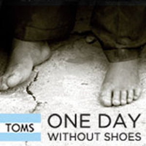
Our very own V.J. is planning a great school and community event to raise awareness about the millions of children that go without shoes each day. Support this great event in April, 2012.
Read more here:
Day Without Shoes
A mile in my shoes
“Don’t judge a man until you have walked a mile in his shoes”.
- Nelle Harper Lee
“Because the human history is the history of shoes. The history of places where we ever tread and stand.”
- Stebby Julionatan
Developing Empathy (Click Here!)
Project Requirements
1. The whole outside of the shoe must be completely painted.
2. The shoe should have a theme (your choice from the following):
Self Portrait Shoe
"In the Style of" a certain artist (Van Gogh, Matisse, Chagall, etc.)
Narrative
Symbolism
3. Remember to use the elements and principles:
Shape/Form
Color Theory and Psychology
Value
Texture
Line
4. Design must be original and have a focal point.
5. Paint base layers first, then paint details.
DUE: March 2nd, 2012
Note: If you do not have shoes that you can use for this project, let me know.
Shoes may be available for cheap at thrift stores. If you have extra shoes at home
that no one is using, please bring them in (with permission from parents/guardians)!

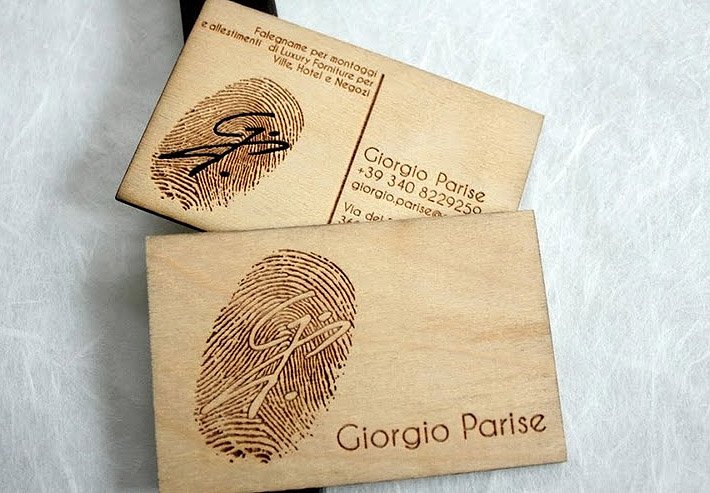
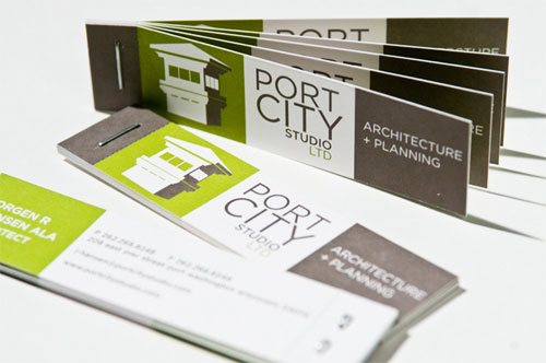
Business Card Design
 When Designing your Business Card:
1) What makes this business card unique?
2) Will you use:
Texture
Custom Shapes
Color schemes
Different papers/printing surfaces used
Creative elements
3) How is the card designed specifically for the specific business and their target market?
4) Would you be willing to purchase this business' products?
Assignment Requirements:
1. Use your logo from the logo assignment.
2. Include the contact information for your business. This contact information needs to be imaginary, but make it look real. For example:
Jiffy Jane's Shoes
1047 College Ave
Meeker, CO 81641
970-555-4555
www.JiffyJanesShoes.com
3. Have at least two of these elements on your business card design:
Textured Background
Design elements that are similar to logo design throughout the design.
A photo or design element that illustrates your business or product (small, with borders that mimic your business card)
Unique shape
4. Keep it simple and clean.
5. Use a color scheme. Go to www.colourlovers.com to create your color scheme and email the link to: mburnell@meeker.k12.co.us
6. Remember to use Craftsmanship and the interesting visual elements to complete the business card.
DUE: February 10th, 2012
Helpful Websites:
Web Designer Depot
Van Delay Design: 11 Business Card Tutorials
Unique Card Designs


Wednesday, February 1, 2012


Subscribe to:
Posts (Atom)