Fences Project
Any art student is allowed to enter the contest upon completion of their fence project. Students are allowed to do an extra fence project AFTER everyone has had the chance to do their first project.
Three Categories:
Most meaningful and/or symbolic
Craftsmanship
Elements & Principles (2/3rds rule/“Fill the frame,” texture, value, symbolism…)
1st place winners will receive homemade cookies & a cowboy coupon!
2nd & 3rd place winners will receive a cowboy coupon!
Deadline to enter is February 1st. Entries must be accompanied by a written statement about your artwork.

Wednesday, December 22, 2010
Art Movement ~ Impressionism
Impressionism was a 19th-century art movement that began as a loose association of Paris-based artists whose independent exhibitions brought them to prominence in the 1870s and 1880s. The name of the movement is derived from the title of a Claude Monet work, Impression, Sunrise (Impression, soleil levant), which provoked the critic Louis Leroy to coin the term in a satiric review published in Le Charivari.
Characteristics of Impressionist paintings include relatively small, thin, yet visible brush strokes, open composition, emphasis on the accurate depiction of light in its changing qualities (often accentuating the effects of the passage of time), ordinary subject matter, the inclusion of movement as a crucial element of human perception and experience, and unusual visual angles.
Impressionism also describes art created in this style, but outside of the late 19th century time period.
~ Source: Wikipedia

Claude Monet
The Cliffs at Etretat
1885

Mary Cassatt
Lydia Leaning on Her Arms (in a theatre box)
1879

Edgar Degas
Tänzerinnen an der Stange
1888

Pierre-Auguste Renoir
Bal du moulin de la Galette
1876
Artist ~ Claude Monet

Photo by Nadar
1899

Waterlilies
1906

Haystacks, (Sunset)
1890-1891

Woman with a Parasol - Madame Monet and Her Son
1875
Claude Monet: French painter, initiator, leader, and unswerving advocate of the Impressionist style. He is regarded as the archetypal Impressionist in that his devotion to the ideals of the movement was unwavering throughout his long career, and it is fitting that one of his pictures--Impression: Sunrise (Musée Marmottan, Paris; 1872)gave the group his name.
His youth was spent in Le Havre, where he first excelled as a caricaturist but was then converted to landscape painting by his early mentor Boudin, from whom he derived his firm predilection for painting out of doors. In 1859 he studied in Paris at the Atelier Suisse and formed a friendship with Pissarro. After two years' military service in Algiers, he returned to Le Havre and met Jongkind, to whom he said he owed `the definitive education of my eye'. He then, in 1862, entered the studio of Gleyre in Paris and there met Renoir, Sisley, and Bazille, with whom he was to form the nucleus of the Impressionist group.
During the Franco-Prussian War (1870-71) he took refuge in England with Pissarro: he studied the work of Constable and Turner, painted the Thames and London parks, and met the dealer Durand-Ruel, who was to become one of the great champions of the Impressionists. From 1871 to 1878 Monet lived at Argenteuil, a village on the Seine near Paris, and here were painted some of the most joyous and famous works of the Impressionist movement, not only by Monet, but by his visitors Manet, Renoir and Sisley. In 1878 he moved to Vétheuil and in 1883 he settled at Giverny, also on the Seine, but about 40 miles from Paris. After having experienced extreme poverty, Monet began to prosper. By 1890 he was successful enough to buy the house at Giverny he had previously rented and in 1892 he married his mistress, with whom he had begun an affair in 1876, three years before the death of his first wife. From 1890 he concentrated on series of pictures in which he painted the same subject at different times of the day in different lights---Haystacks or Grainstacks (1890-91) and Rouen Cathedral (1891-95) are the best known. He continued to travel widely, visiting London and Venice several times (and also Norway as a guest of Queen Christiana), but increasingly his attention was focused on the celebrated water-garden he created at Giverny, which served as the theme for the series of paintings on Water-lilies that began in 1899 and grew to dominate his work completely (in 1914 he had a special studio built in the grounds of his house so he could work on the huge canvases).
In his final years he was troubled by failing eyesight, but he painted until the end. He was enormously prolific and many major galleries have examples of his work.
Born Nov. 14, 1840 in Paris and died Dec. 5, 1926 in Giverny
Source: http://www.ibiblio.org/wm/paint/auth/monet/
Between Fences Project and Extra Credit!
Meeker's White River Museum has the privilege of having a Smithsonian exhibit on display until February 26th! As a class we will be making some fence posts for our first project of the semester.
We live between Fences.
The United States as we know it could not have been settled and built without fences. They continue to be an integral part of our Nation. Fences stand for security.
FENCED IN or FENCED OUT
WE may hardly notice them, but fences are dominant features in our lives and in our history.
Fences are more than functional objects. They are powerful symbols. The way we define ourselves as individuals and as a nation becomes concrete in how we build fences.
FENCES ARE POWERFUL SYMBOLS
We use them to enclose our houses and our neighborhoods. They are decorative structures that are as much a part of the landscape as trees and flowers. Without fences, agriculture and industry would be difficult to imagine. Private ownership of lands would be an abstract concept.
BETWEEN FENCES IS A COMPELLING LOOK AT PAST, PRESENT AND FUTURE HISTORY. ~ Source: White River Museum brochure
For more information, please check this link out:
Smithsonian
EXTRA CREDIT: Visit the White River Museum and write about your experience. If you present it to the class you earn additional extra credit!
EXTRA CREDIT: Read and write a book report about any of the following books for extra credit. Make sure you make reference to our fence project in your report.
Barbed Wire: A Political History by Oliver Razac and Jonathan Kneight
Bury My Heart at Wounded Knee: An Indian History of the American West by Dee Brown
The Magic Curtain: The Mexican-American Border in Fiction, Film, and Song by Thomas Torrans
Tuesday, December 21, 2010
Art Supplies Needed
The art room needs new art supplies! If you would like to donate to your student's art room, click on the link below. Any and all donations are appreciated! Happy Holidays!
Art Room Supply Wish List
Art Room Supply Wish List
Friday, December 17, 2010
Miz Art ~ How to properly clean your brushes
Second Semester, Week One Miz Art
Read this article and fill in the Miz Art below:
Cleaning Paint Brushes (OIL PAINTING)
Your Miz Art is to type ALL of the steps listed in this article. We have had issues with brushes being cleaned improperly and ruined. Cleaning brushes properly is utterly important!
DUE January 17th
Read this article and fill in the Miz Art below:
Cleaning Paint Brushes (OIL PAINTING)
Your Miz Art is to type ALL of the steps listed in this article. We have had issues with brushes being cleaned improperly and ruined. Cleaning brushes properly is utterly important!
DUE January 17th
Happy Holidays!
I'm really proud of all of the wonderful Meeker High School students! It's been so fun getting to know each and every one of you. I am truly grateful to be your teacher. I can't wait to teach you all about oil painting and ceramics next semester!
Merry Christmas and Happy New Year!
Warmest,
Miz Burnell
Merry Christmas and Happy New Year!
Warmest,
Miz Burnell
Tuesday, December 7, 2010
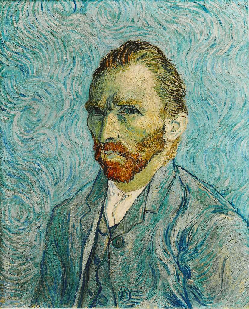
Theories about van Gogh's ear
 ~ Self Portrait by Vincent van Gogh
Gauguin and van Gogh
Gauguin's relationship with van Gogh was rocky. Gauguin had shown an early interest in Impressionism, and the two shared bouts of depression and suicidal tendencies. In 1888, Gauguin and van Gogh spent nine weeks together, painting in the latter's Yellow House in Arles. During this time, Gauguin became increasingly disillusioned with Impressionism, and the two quarreled. On the evening of December 23, 1888, frustrated and ill, van Gogh confronted Gauguin with a razor blade. In a panic, van Gogh fled to a local brothel. While there, he cut off the lower part of his left ear lobe. He wrapped the severed tissue in newspaper and handed it to a prostitute named Rachel, asking her to "keep this object carefully." Gauguin left Arles and never saw van Gogh again. A few days later, van Gogh was hospitalized. ~ Wikipedia
The Duel Theory
A new study claims Vincent van Gogh may have made up the story to protect painter Paul Gauguin who actually lopped it off with a sword during an argument.
Self Portrait with Bandaged Ear, 1889 by Vincent van Gogh (1853-90)
German art historians say the true version of events never surfaced as the two men both kept a "pact of silence" – Gauguin to avoid prosecution and van Gogh in a vain attempt to keep a friend... ~ By Henry Samuel
 ~ Self Portrait by Paul Gauguin
Bullfights
Another explanation is that van Gogh was influenced by the bullfights that he saw in Arles. The tradition is that a matador would after a fight cut off the ear of the bull and present it to a lady of his choice. This seems that van Gogh was confused in his own head, and thought of himself as both the winner (matador) and the loser (bull) in the same time, and thus cut off his own ear, and just like the matador does, presented it to Rachel, a lady of his choice (Runyan).
Biblical
There is a scene in the Bible, in which Simon Peter cut off the ear of Malchus. This scene van Gogh actually tried to paint in the summer of 1888, the same ear he cut off his ear. It was also mentioned in his letter to his sister in October the same year. During a psychotic attack, Vincent maybe tried to act out this scene, using himself for both the roles of the victim and the aggressor (Runyan).
Auditory
Van Gogh might have very likely experienced very vivid auditory hallucinations at the time. He also believed that such hallucinations might have been due to a disease of the nerves in the ears. Thus it is credible to believe that during a psychotic attack, he could have felt that cutting off his ear would disconnect these nerves and thus free him from the disturbing sounds he was hearing (Runyan).
~ http://blogs.princeton.edu/wri152-3/f05/skrstic/other_theories.html
Thursday, December 2, 2010
Schedule & Due Dates
ART I - IV Scedule & Due Dates
December 10th: Typed 8 Miz Arts are due.
December 17th: Final Art Projects are due.
Remember: Art II - IV students have two large projects or three medium projects due by the end of the semester!
December 20th: All students will be making study guides for the final exam.
December 21st: Final Exam & Critique Day.
December 22nd: Art Games & End of the Semester Party
PLEASE NOTE: STUDENTS THAT PLAN ON MISSING ANY OF THE ABOVE DATES NEED TO REQUEST THE FINAL EXAM EARLY. THE FINAL EXAM IS WORTH 10% OF YOUR GRADE!
Computer Graphics Schedule & Due Dates
December 17th: Final Digital Painting Project is due.
December 20th: Students will be making study guides for the final exam.
December 21st: Final Exam & Critique Day.
December 22nd: Art Games & End of the Semester Party
PLEASE NOTE: STUDENTS THAT PLAN ON MISSING ANY OF THE ABOVE DATES NEED TO REQUEST THE FINAL EXAM EARLY. THE FINAL EXAM IS WORTH 10% OF YOUR GRADE!
Computer Graphics: Study Guide for Final Exam
Below are the skills, vocabulary and artists that you will need to know for the final exam. Students will be working in groups to create a study guide. Remember: There will be no re-takes of the test - so study hard! If you don't know it, ask Ms. Burnell. I am happy to help!
Elements & Principles of Art
Line
Shape
Color
Value
Form
Texture
Space
Contrast
Artists & Art Movements
Salvador Dali
Katrin Eismann
Surrealism
Vocabulary, Tools & Techniques
Symbolism
Composition
2/3rds Rule or Rule of Thirds
"Fill the Frame"
Focal Point
Critique
Constructive Criticism
Canvas
Bleed
Guides
Heal Tool
Clone Tool
Magic Wand
Select Tool
Layers
Opacity
Texture
Border
Photoshop
Crop
Paint Bucket
Gradient
Text
Eraser
Eyedropper
History
Filter
PSD file
JPG file
Morph
Wacom Tablet
Paintbrush
Art I - IV: Study Guide for Final Exam
Below are the skills, vocabulary and artists that you will need to know for the final exam. All students will be working in groups to create a study guide. Remember: There will be no re-takes of the test - so study hard! If you don't know it, ask Ms. Burnell. I am happy to help!
Elements & Principles of Art
Line
Shape
Color
Value
Form
Texture
Space
Contrast
Artists
M.C. Escher
Romare Bearden
Pablo Picasso
Frida Kahlo
Paul Gauguin
Elizabeth Catlett
Art Movements
Cubism
Abstract
Harlem Renaissance
Mediums
Pen & Ink
Collage
Acrylic Painting
Mixed Media
Printmaking
Vocabulary
Primary Colors
Secondary Colors
Warm Colors
Cool Colors
Complementary Colors
Color Mixing
Organic Shapes
Geometric Shapes
Asymmetrical Shapes
Symmetrical Shapes
Value
Shades
Tints
Hatching
Cross-hatching
Stippling
Blind Contour Drawing
Symbolism
Self-Portrait
Color Psychology
Background
Facial Proportions
Composition
2/3rds Rule or Rule of Thirds
"Fill the Frame"
Focal Point
One Point Perspective
Two Point Perspective
Three Point Perspective: Bird's Eye View & Worm's Eye View
Negative Space
Positive Space
Proofs
Edition
Veiner
Gouger
Linocutter
Critique
Constructive Criticism
Acrylic Paint
Brayer
Ink
Linocutter
Linoleum Block
Monday, November 29, 2010
Extra Credit
If you need extra credit, please take advantage of the extra credit opportunities below. There are numerous other extra credit options on the blog.
1. Write a research paper about an artist or art movement. Worth up to 100 points, based on quality.
2. Create an art game to play in class. Must include art vocabulary and/or skills. Worth up to 25 points, based on quality.
3. Make a music video about art. Must include art vocabulary and/or skills. Worth up to 100 points, based on quality.
4. Create a visual study guide using ALL of the vocabulary learned in class so far. Must use examples of artwork.
Art vocabulary includes artists, art movements, terminology, skills, materials...
Remember quality is important! You must put time and effort into the extra credit assignments to get full points.
Katrin Eismann ~ Digital Artist

Selection from her artist statement: "Enduring art speaks to the human condition with emotional honesty and clarity. As a practicing artist it is difficult to recognize if my images are or will be of any enduring value. Art is successful if it stimulates a reaction or discussion within the viewer. This process enables art to exist long after the paper has crumbled away or the musical notes have faded into silence."
Computer Graphics Class: Digital Painting
Our final project for the semester is the Wacom Digital Painting Project.
REQUIREMENTS
1. 8X10 canvas; 300 ppi
2. The WHOLE image must be painted and/or drawn!
3. Use the 2/3rds rule OR fill the frame (composition)
4. Must have a focal point
5. Must use at least five different brushes.
Subject matter is up to you
Hard Deadline: December 15th, 2010

~ Parag Lavande

~ Michael S.

~ Michael S.

~ George Patsouras
Art I - IV Students: Final Art Project

On the final art project, which is due December 17th, please remember that you will be graded on the following:
* Following Directions
* Craftsmanship
* Attitude
* Use of Principles of Art and Elements of Design
* Problem Solving & Originality
* Focal point, 2/3rds rule, value, symbolism, texture...
Tuesday, November 23, 2010
Extra Credit: Gratitude

Thanksgiving is just a couple of days away! To earn extra credit points:
Reflect on your life. What are you most thankful for?
Sketch it for additional points.
Happy Thanksgiving!
Monday, November 22, 2010
November 22nd
If you missed class on Monday, November 22nd you need to do the following:
1. See Ms. Burnell about your grade.
2. Complete missing assignments and turn in.
3. Make sure you are on track to turn in two final projects by the hard deadlines.
4. Make sure you have all handouts and worksheets. Get the worksheets from the graded pile. Remember: You will not be able to re-take the test this time. So study, study, study!
Thank you!
Thursday, November 18, 2010
Artist ~ Elizabeth Catlett

Photo of Elizabeth Catlett from book on African American artists by Fern H. Logan, an assistant professor of photography at Southern Illinois University Carbondale. See the article at http://news.siu.edu/news/January01/loganphotos.html

Elizabeth Catlett
Mexican (born United States), born 1915
Sharecropper, 1957 (printed 1970)
Color linocut on cream Japanese paper
54.4 x 51.3 cm
Restricted gift of Mr. and Mrs. Robert S. Hartman, 1992.182
The Art Institute of Chicago®
"In a career spanning more than 70 years, Elizabeth Catlett has created sculptures that celebrate the heroic strength and endurance of African-American and Mexican working-class women. With simple, clear shapes she evokes both the physical and spiritual essence of her subjects. Her hardy laborers and nurturing mothers radiate both power and a timeless dignity and calm. Whether working in wood, stone, bronze, or clay, Catlett reveals an extraordinary technical virtuosity, a natural ability to meld her curving female forms with the grain, whorls, color, or luster of her chosen medium. The beauty of her subjects is matched by the beauty she reveals in her sculptural materials.
Throughout her career, Catlett has been a political progressive committed to improving the lives of African-American and Mexican women, and she has often used her art explicitly to advance their cause. She has also protested, picketed, and even been arrested in her quest to win justice for those she describes as "my people." Moving from the United States to Mexico in 1946, she was eventually identified as an "undesirable alien" by the U.S. State Department. For nearly a decade she was barred from visiting the United States.
Despite these struggles, Catlett's art reveals no trace of bitterness or despair. Indeed, she has remained true to the universal, life-affirming themes that first animated her sculpture in the 1940s—the beauty of the human form and the nobility of the human condition. At age 95, she continues to create, guided by those unshakeable ideals."
Jeff Harrison
Chief Curator
Chrysler Museum of Art
To learn more about Elizabeth Catlett, please visit these websites:
http://www.elizabethcatlett.net/
http://www.nmwa.org/collection/profile.asp?LinkID=129
http://www.pbs.org/wnet/aaworld/arts/catlett.html
Tuesday, November 16, 2010
Miz Art ~ Honor & Respect
This semester we have created some symbolic self portraits and we have also learned about the artist Elizabeth Catlett. Catlett represents her subjects as dignified, strong and resilient.
This is your Miz Art:
Who, in your life, has shown you either compassion, dignity or strength. Please describe the characteristics of this person. If you could make an artwork about this person, what would it look like? Please use your art vocabulary when describing the artwork.
This is your Miz Art:
Who, in your life, has shown you either compassion, dignity or strength. Please describe the characteristics of this person. If you could make an artwork about this person, what would it look like? Please use your art vocabulary when describing the artwork.
Miz Art ~ Personal Quote
Almost every day this semester we have had a new quote on the chalkboard. Many of these quotes have been motivational or inspirational. Some are just full of common sense.
This is your Miz Art:
1. What has your favorite quote been so far, and why?
2. Pick a quote that you feel applies to your life. Explain why it is important to you.
This is your Miz Art:
1. What has your favorite quote been so far, and why?
2. Pick a quote that you feel applies to your life. Explain why it is important to you.
Miz Art ~ Art Proposal
Your final art project for the semester:
1. What medium will you use? Acrylics? Colored Pencil? Linocut? Pen and Ink?
2. What is your concept/idea?
3. What will your subject/focal point be?
4. What will your composition look like?
5. How will you use texture, value, line, shape, form and symbolism?
1. What medium will you use? Acrylics? Colored Pencil? Linocut? Pen and Ink?
2. What is your concept/idea?
3. What will your subject/focal point be?
4. What will your composition look like?
5. How will you use texture, value, line, shape, form and symbolism?
Miz Art ~ Negative and Positive Space
1. Type the definitions of both negative and positive space (should be in your notes).
2. Add an image of a linocut print by any artist to your paper.
3. Label the negative and positive space (use arrows).
Thank you!
2. Add an image of a linocut print by any artist to your paper.
3. Label the negative and positive space (use arrows).
Thank you!
Monday, November 15, 2010
Miz Art ~ Favorite Artist
Miz Art
1. Who is your favorite artist and why?
2. What is your favorite work of art by this artist? Describe it in detail using your art vocabulary.
1. Who is your favorite artist and why?
2. What is your favorite work of art by this artist? Describe it in detail using your art vocabulary.
All Miz Art Answers are due TYPED on December 10th!
Please type up ALL of your Miz Art answers and turn them in by December 10th. There are 8 Miz Arts this quarter.
If you would like to use the computer during class time to type the answers, you may do so. Make sure you save your document on your H Drive.
Thank you!
If you would like to use the computer during class time to type the answers, you may do so. Make sure you save your document on your H Drive.
Thank you!
Friday, November 12, 2010


Thursday, November 11, 2010
Veteran's Day
Thank you to all of our Veterans! We appreciate all of your dedication, hard work and sacrifice! We honor and thank you today.
Friday, November 5, 2010
November 8th ~ Printmaking
If you missed class on November 8th, please complete the following:
1. Read all printmaking related articles/posts on the blog.
2. Get the handouts and worksheets from the top drawer of filing cabinet (2 on printmaking, one safety and one safety agreement form).
3. Fill out the worksheet and sign the safety agreement form.
4. Turn in the safety agreement form.
5. Put all other worksheets and handouts in your perspective pocket.
6. Read the Notebook lesson on Ms. Burnell's computer.
7. See Ms. Burnell if you have any other questions
Thank you!
Wednesday, November 3, 2010
Miz Art ~ Printmaking
For this week's Miz Art, please complete the following steps:
1. Search for an artist that uses printmaking methods to make prints. You can look at silkscreen prints, linocut prints, lithographic prints, woodcut prints, etched prints, monoprints (or any other printmaking technique that you are interested in).
2. Find a work of art that you like by this artist and print it out (if it is not copyrighted). If it is copyrighted, email me the link to the image. Tape the image into your sketchbook.
3. Describe the artwork using your art vocabulary. Remember, we have been learning about positive and negative space, value, line, texture, form, shape, composition, symbolism, complementary colors, color psychology and more.
You MUST have at least THREE sentences and use at least TEN vocabulary words or references.
Tuesday, November 2, 2010
Miz Art ~ Semester Due Dates
This week's Miz Art is quite easy. Simply write the deadlines below in your notebook. Read the deadlines thoroughly - this is when everything is due! Very important information here! Make sure you label it as "Miz Art Due Dates". Thank you!
SOFT DEADLINES (Goal)
Perspective for Art I students: November 5th, 2010
Project I for Art II, III and IV students: November 12th, 2010
Printmaking for Art I students: November 12th, 2010
Project II for Art II, III and IV students: December 10th, 2010
Project III for Art I students: December 10th, 2010
HARD DEADLINES (Absolute Due Date)
Self Portrait for Art I students: November 5th, 2010
Perspective for Art I students: November 23rd, 2010
Project I for Art II, III and IV students: December 3rd, 2010
Printmaking for Art I students: December 10th, 2010
Project II for Art II, III and IV students: December 17th, 2010
Project III for Art I students: December 17th, 2010
REMEMBER that if you turn in an assignment after the hard deadline points are taken off! A project that is turned in one day late will have a 10% penalty. A project that is turned in two or more days late will have a 50% penalty!
Art Show!
Everyone is welcome to view the art on display at the admin building this week. The show will be up until November 12th.
I am very proud of my hard working Meeker High School students! They are creating some amazing artwork!
I am very proud of my hard working Meeker High School students! They are creating some amazing artwork!
Wednesday, October 27, 2010
Extra Credit!
This extra credit opportunity involves perspective. Follow the steps below:
1. Find an artwork that incorporates perspective.
2. Print and tape into your sketchbook.
3. Draw with your ruler and a red marker or pen: the vanishing point and the lines leading to the vanishing points.
4. Label the artwork as 1, 2 or 3 point perspective.
If done correctly, you can earn 15 points of extra credit.
October 26th, 2010 ~ Perspective


If you missed class on Tuesday, October 26th, please search the blog for other perspective articles AND read the information below:
During the Renaissance, perspective was being discovered by artists. M.C. Escher played with perspective in his artwork. Perspective plays an important part in creating "believable" artworks.
WRITE THE NOTES BELOW IN YOUR SKETCHBOOK (and get the sketches from a classmate)
How to create a 2 point perspective drawing:
1. Draw Horizon Line and pick two vanishing points.
2. Draw a vertical line that will become the corner of the closest building. Connect the lines at the top and bottom of the line to the vanishing points.
3. Add two more vertical lines to finish your first building. These lines should be parallel to your first vertical line.
4. Distance is tricky: Divide the bottom line in half, and then in half again, and then in half again. This will make it seem as if equal-sized buildings are next to each other.
5. Now draw other lines from your main vertical line to the vanishing points to create other buildings in distance.
6. Erase your guidelines, finish the basic shapes for your buildings.
7. How you complete your artwork is up to you! Add windows, building details, people, cars, trees, and anything else that will add detail to your perspective artwork!
You can choose any of the following mediums for your perspective artwork:
* Pencil
* Pen and Ink (sharpie)
* Colored Pencil
* Collage
* Acrylic Paint
Project Requirements:
* Must use one, two or three point perspective
* Must demonstrate knowledge of CORRECT perspective
* Add detail and color (or value if you are working in black and white)
REMEMBER: Draw lightly at first! This is important because when you are ready to erase the guide lines that are unnecessary you want them to erase easily. Dark pencil marks are difficult to erase.


Student Samples from: http://www.princetonol.com/groups/iad/lessons/middle/perspective.htm
Monday, October 25, 2010
Miz Art ~ Perspective
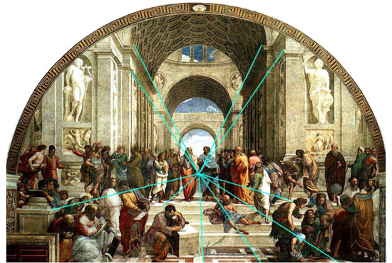
Miz Art Question # 4:
What kind of perspective does Raphael use in the painting "School of Athens"?
(This is the easiest question yet, so enjoy)
The Power of Words
Students: You made a difference! Please read this letter from our soldier, Jeffried:
"Hello Melanie!!!!
I received your package today and I have to admit I was happy, overwhelmed and just plain overjoyed when I saw the cards.
I have had a chance to share them with the rest of the Soldiers that
are stationed here.
The place where we eat our meals is called the DFAC. They allowed me to
use a table and spread your cards out for display.
At first Soldiers just looked and walked by....... but later the art
work and love that was placed in each card drew a crowd.
Soldiers started sitting around the table chatting and talking about the
memories the pictures sparked. I was not expecting this reaction.
About half the cards were taken and the other half will go up on our
unit wall.
Please thank your team of artists for which this was possible. Thank
you........ you all make me proud to be American.
Thank you,
JEFFRIED A."
His letter says it all. Each one of us makes a difference every day. Whether we make it positive or negative is up to us. We can influence and lift other people up with our kind thoughts and actions. Gratitude, is after all, the best attitude.
Thanks again to all of our hard-working and dedicated men and women serving our country! We are blessed to have you looking out for us! I wish we could make a special collage for each and every one of you!
And thanks to the students and teachers that took the time, effort and thought to create the collages for our soldiers!
Texture


Texture: How the surface of an object feels. In 2-dimensional artwork we create the illusion of texture with our lines.
Monday, October 25th ~ Texture & Critique
If you missed class Monday, October 25th, you need to get the two texture worksheets as well as the self assessment rubric. To make up for the missed class, finish the worksheets and rubric and critique another student's artwork. If you have questions on how to do this, come see me.
The critique is 10% of your grade and is very important. If you do not have access to another student's artwork, then pick an artwork by a famous artist to critique. Remember: use your art vocabulary!
Thank you!
The critique is 10% of your grade and is very important. If you do not have access to another student's artwork, then pick an artwork by a famous artist to critique. Remember: use your art vocabulary!
Thank you!
Wednesday, October 20, 2010
Critique on Monday!
All classes will be having a critique on Monday. Please be prepared to offer words of praise, constructive criticism and encouragement to your fellow students. The students at Meeker High School have been making some wonderful artwork this first quarter! I can't wait to see what you create throughout the year!
Tuesday, October 19, 2010
Perspective
Using perspective in our artwork helps us create "believable" scenery. The farther away an object is, the smaller it appears. We also create perspective by using "vanishing points" and rulers. See the website below for a step by step tutorial:
2 Point Perspective Drawing Lesson
Here is another website that is great for experimenting with perspective. Click a scene and add houses, trees, people and other objects.
Perspective Game

Click on image to make it larger.
2 Point Perspective Drawing Lesson
Here is another website that is great for experimenting with perspective. Click a scene and add houses, trees, people and other objects.
Perspective Game

Click on image to make it larger.
Monday, October 18, 2010
Friday, October 15, 2010
Miz Art ~ Jacob Lawrence's "The Great Migration"

"Through a series of paintings, in The Great Migration, Jacob Lawrence illustrates the mass exodus of African-Americans who moved to the North in search for a better life. Lawrence's parents were among those who migrated between 1916-1919, considered the first wave of the migration.
Lawrence himself was not a direct witness to the migration, but his artistic talent prompted his teachers and friends to persuade him to express those events in paintings. Subsequently, after extensive research, Lawrence gathered enough information about the migration to compile a story in paintings about the subject."
Source: http://www.columbia.edu/itc/history/odonnell/w1010/edit/migration/migration.html
Miz Art Number Three:
Many African Americans fled the South because of discrimination, segregation, and violence. Define and discuss discrimination. How does Lawrence address discrimination and segregation in The Migration Series? View Jacob Lawrence's migration series at the website below to find your answer:
http://www.phillipscollection.org/migration_series/flash/experience.cfm
Christy Marquette - The Denver Post!
Meeker High School's own Christy Marquette will have an article printed in the Denver Post this weekend! We are so proud of you, Christy! Way to go!
EXTRA CREDIT: Beautiful Autumn!
EXTRA CREDIT:
Where is your favorite local getaway in autumn? Why?
If you answer in your sketchbook = 5 points
Answer AND take/draw a picture = 15 points
Answer AND take a picture AND give directions = 20 points
All photos are copyright 2010 by Melanie Burnell of Artiste Photography

Copyright 2010 by Melanie Burnell of Artiste Photography

Copyright 2010 by Melanie Burnell of Artiste Photography

Copyright 2010 by Melanie Burnell of Artiste Photography

Copyright 2010 by Melanie Burnell of Artiste Photography
Thursday, October 7, 2010
First Quarter Test on October 15th!
Study up for the first quarter test. The test will be on art history, the elements and principles of art, and vocabulary.
Sketchbooks due on October 15th!
See previous post about sketchbooks to see sketchbook requirements. Notes in your sketchbook should indicate what you need to do to get the full 100 points. Sketchbook grades are 10% of your total grade.
Remember your "Miz Art" blog questions!
Remember your "Miz Art" blog questions!
Thursday, September 30, 2010
Frida Kahlo ~ Self Portrait Unit


"Frida Kahlo de Rivera (July 6, 1907 – July 13, 1954; born Magdalena Carmen Frieda Kahlo y Calderón) was a Mexican painter, born in Coyoacán. Perhaps best known for her self-portraits, Kahlo's work is remembered for its 'pain and passion', and its intense, vibrant colors. Her work has been celebrated in Mexico as emblematic of national and indigenous tradition, and by feminists for its uncompromising depiction of the female experience and form.
Mexican culture and Amerindian cultural tradition figure prominently in her work, which has sometimes been characterized as Naïve art or folk art. Her work has also been described as 'surrealist', and in 1938 one surrealist described Kahlo herself as a ribbon around a bomb'.
Kahlo had a stormy but passionate marriage with the prominent Mexican artist Diego Rivera. She suffered lifelong health problems, many of which stemmed from a traffic accident in her teenage years. These issues are reflected in her works, more than half of which are self-portraits of one sort or another. Kahlo suggested, 'I paint myself because I am so often alone and because I am the subject I know best.'"
http://en.wikipedia.org/wiki/Frida_Kahlo
Important Components of the Self-Portrait
Websites about Frida Kahlo:
http://www.fridakahlo.com/
Background
Expression
Clothing
Symbolism
Color
Direction of the eyes: Looking at the viewer (confrontational) or off into the distance.
Paint Instructions:
Paint background first THEN draw portrait on canvas.
Demo on flesh tones next week.
Pay attention to, and experiment with, your brushstrokes.
Care Instructions:
We are using ACRYLIC PAINTS!
DO NOT use oil paints!
Always wear apron and put newsprint or scrap paper under your work area.
Wash brushes thoroughly and put brush side up in the brush cup next to sink.
Only squeeze out enough paint for your work for the day: Don't waste!
If you have too much at the end of class, either cover it in plastic for use the next day OR scrape it out with a paper towel and WASH the palette.
Make sure you wash the palettes.
Clean up after yourself!
Plan your portrait:
1) Expression
2) Composition (where do you want to be placed in the portrait and how much of you will be visible)
3) Color
4) Background
5) Symbols
6) Direction of your eyes
Plan your portrait in your sketchbook. Address every component listed above.
Sketch out your portrait (or potential ideas).
IMPORTANT: If you missed this lesson (September 29th, 2010) then you MUST view the Smart Board lesson on Ms. Burnell's computer in your next art class.
Monday, September 27, 2010
Miz Art ~ Psychology of Color
Colors often have different meanings in various cultures. And even in Western societies, the meanings of various colors have changed over the years. But today in the U.S., researchers have generally found the following to be accurate.
Black
Black is the color of authority and power. It is popular in fashion because it makes people appear thinner. It is also stylish and timeless. Black also implies submission. Priests wear black to signify submission to God. Some fashion experts say a woman wearing black implies submission to men. Black outfits can also be overpowering, or make the wearer seem aloof or evil. Villains, such as Dracula, often wear black.

Albrecht Durer
Self Portrait
White
Brides wear white to symbolize innocence and purity. White reflects light and is considered a summer color. White is popular in decorating and in fashion because it is light, neutral, and goes with everything. However, white shows dirt and is therefore more difficult to keep clean than other colors. Doctors and nurses wear white to imply sterility.

Mary Cassatt
Self Portrait
Red
The most emotionally intense color, red stimulates a faster heartbeat and breathing. It is also the color of love. Red clothing gets noticed and makes the wearer appear heavier. Since it is an extreme color, red clothing might not help people in negotiations or confrontations. Red cars are popular targets for thieves. In decorating, red is usually used as an accent. Decorators say that red furniture should be perfect since it will attract attention.

Jacob Lawrence
Self Portrait
The most romantic color, pink, is more tranquilizing. Sports teams sometimes paint the locker rooms used by opposing teams bright pink so their opponents will lose energy.
Blue
The color of the sky and the ocean, blue is one of the most popular colors. It causes the opposite reaction as red. Peaceful, tranquil blue causes the body to produce calming chemicals, so it is often used in bedrooms. Blue can also be cold and depressing. Fashion consultants recommend wearing blue to job interviews because it symbolizes loyalty. People are more productive in blue rooms. Studies show weightlifters are able to handle heavier weights in blue gyms.
Vincent Van Gogh
Self Portrait
Green
Currently the most popular decorating color, green symbolizes nature. It is the easiest color on the eye and can improve vision. It is a calming, refreshing color. People waiting to appear on TV sit in "green rooms" to relax. Hospitals often use green because it relaxes patients. Brides in the Middle Ages wore green to symbolize fertility. Dark green is masculine, conservative, and implies wealth. However, seamstresses often refuse to use green thread on the eve of a fashion show for fear it will bring bad luck.
.jpg)
Frida Kahlo
Self Portrait
Yellow
Cheerful sunny yellow is an attention getter. While it is considered an optimistic color, people lose their tempers more often in yellow rooms, and babies will cry more. It is the most difficult color for the eye to take in, so it can be overpowering if overused. Yellow enhances concentration, hence its use for legal pads. It also speeds metabolism.

Bellany
Self Portrait
Purple
The color of royalty, purple connotes luxury, wealth, and sophistication. It is also feminine and romantic. However, because it is rare in nature, purple can appear artificial.

Andy Warhol
Self Portrait
Fun Fact: This painting just sold for $32.5 billion dollars at Sotheby's!
Brown
Solid, reliable brown is the color of earth and is abundant in nature. Light brown implies genuineness while dark brown is similar to wood or leather. Brown can also be sad and wistful. Men are more apt to say brown is one of their favorite colors.

Raphael
Self Portrait
Food for Thought
While blue is one of the most popular colors it is one of the least appetizing. Blue food is rare in nature. Food researchers say that when humans searched for food, they learned to avoid toxic or spoiled objects, which were often blue, black, or purple. When food dyed blue is served to study subjects, they lose appetite.
Green, brown, and red are the most popular food colors. Red is often used in restaurant decorating schemes because it is an appetite stimulant.
by David Johnson
Miz Art Question
Art I Students: What colors are you going to use in your portrait, and why?
Computer Graphics & Art II, III & IV Students: How will the knowledge of the psychology of color change your artwork? How will use color symbolically?
Read more: Color Psychology — Infoplease.com http://www.infoplease.com/spot/colors1.html#ixzz10jwCDYBT
Miz Art # 2 for week of 10/4/10
Black
Black is the color of authority and power. It is popular in fashion because it makes people appear thinner. It is also stylish and timeless. Black also implies submission. Priests wear black to signify submission to God. Some fashion experts say a woman wearing black implies submission to men. Black outfits can also be overpowering, or make the wearer seem aloof or evil. Villains, such as Dracula, often wear black.
Albrecht Durer
Self Portrait
White
Brides wear white to symbolize innocence and purity. White reflects light and is considered a summer color. White is popular in decorating and in fashion because it is light, neutral, and goes with everything. However, white shows dirt and is therefore more difficult to keep clean than other colors. Doctors and nurses wear white to imply sterility.
Mary Cassatt
Self Portrait
Red
The most emotionally intense color, red stimulates a faster heartbeat and breathing. It is also the color of love. Red clothing gets noticed and makes the wearer appear heavier. Since it is an extreme color, red clothing might not help people in negotiations or confrontations. Red cars are popular targets for thieves. In decorating, red is usually used as an accent. Decorators say that red furniture should be perfect since it will attract attention.
Jacob Lawrence
Self Portrait
The most romantic color, pink, is more tranquilizing. Sports teams sometimes paint the locker rooms used by opposing teams bright pink so their opponents will lose energy.
Blue
The color of the sky and the ocean, blue is one of the most popular colors. It causes the opposite reaction as red. Peaceful, tranquil blue causes the body to produce calming chemicals, so it is often used in bedrooms. Blue can also be cold and depressing. Fashion consultants recommend wearing blue to job interviews because it symbolizes loyalty. People are more productive in blue rooms. Studies show weightlifters are able to handle heavier weights in blue gyms.
Vincent Van Gogh
Self Portrait
Green
Currently the most popular decorating color, green symbolizes nature. It is the easiest color on the eye and can improve vision. It is a calming, refreshing color. People waiting to appear on TV sit in "green rooms" to relax. Hospitals often use green because it relaxes patients. Brides in the Middle Ages wore green to symbolize fertility. Dark green is masculine, conservative, and implies wealth. However, seamstresses often refuse to use green thread on the eve of a fashion show for fear it will bring bad luck.
Frida Kahlo
Self Portrait
Yellow
Cheerful sunny yellow is an attention getter. While it is considered an optimistic color, people lose their tempers more often in yellow rooms, and babies will cry more. It is the most difficult color for the eye to take in, so it can be overpowering if overused. Yellow enhances concentration, hence its use for legal pads. It also speeds metabolism.
Bellany
Self Portrait
Purple
The color of royalty, purple connotes luxury, wealth, and sophistication. It is also feminine and romantic. However, because it is rare in nature, purple can appear artificial.
Andy Warhol
Self Portrait
Fun Fact: This painting just sold for $32.5 billion dollars at Sotheby's!
Brown
Solid, reliable brown is the color of earth and is abundant in nature. Light brown implies genuineness while dark brown is similar to wood or leather. Brown can also be sad and wistful. Men are more apt to say brown is one of their favorite colors.
Raphael
Self Portrait
Food for Thought
While blue is one of the most popular colors it is one of the least appetizing. Blue food is rare in nature. Food researchers say that when humans searched for food, they learned to avoid toxic or spoiled objects, which were often blue, black, or purple. When food dyed blue is served to study subjects, they lose appetite.
Green, brown, and red are the most popular food colors. Red is often used in restaurant decorating schemes because it is an appetite stimulant.
by David Johnson
Miz Art Question
Art I Students: What colors are you going to use in your portrait, and why?
Computer Graphics & Art II, III & IV Students: How will the knowledge of the psychology of color change your artwork? How will use color symbolically?
Read more: Color Psychology — Infoplease.com http://www.infoplease.com/spot/colors1.html#ixzz10jwCDYBT
Miz Art # 2 for week of 10/4/10
Saturday, September 25, 2010
Work Habits Self Evaluation Due Wednesday
ALL Art I - IV and Computer Graphics students MUST fill out a work habits self evaluation on Wednesday. We will be starting a new lesson on Thursday.
Art II - IV students should be starting their third project for the quarter soon to stay on track. Three final art projects are due by the end of the quarter.
Art II - IV students should be starting their third project for the quarter soon to stay on track. Three final art projects are due by the end of the quarter.
Thursday, September 23, 2010
Picasso Multi-Media Lesson - Next Step

After the glue has dried and you have added the layer of ink with your brayer, it is time to add color. Using either pastels, colored pencils or acrylic paint (or a combination of all three), add color to your artwork. Work around the black glue lines with your materials.
Colored Pencil: Prismacolor colored pencils have vibrant and saturated color. These pencils are very expensive, so take great care of them. Do not use the electric or wall pencil sharpener on the Prismacolors. Only use the oblong black sharpeners or the little silver sharpeners.
Colored Pencil will allow some of the black ink layer below to shine through. Blend layers of different colors for more depth in your colors.


Pastels: Pastels have a softer feel. Layering different colors with pastels can also create depth and visual interest. You have the option of leaving the layer of pastels as they are laid on or blending it in with your finger. Please keep in mind that pastels need a spray fixative when finished. This sometimes mutes colors or makes the pastels blend in with the ink (in this project).

Acrylic Paints: Acrylic paints bring the water-soluble quality of the block ink out. You will notice that the ink gets brought to the surface if your paintbrush has too little paint on it. Pput a lot of acrylic on your brush and pay attention to your brush strokes.

Remember: You MUST use at least one set of complementary colors. You MUST use bright colors in at least 2/3rds of your image. Use warm colors near or on your focal point. Wear your aprons and clean up thoroughly please!

Subscribe to:
Posts (Atom)